bricks-and-mortar was sinking
we made the app a lifeline
for

•
Conversion Rate Optimisation
•
App Store Optimisation
•
content strategy
•
Testing strategy
•
creative direction
• Conversion Rate Optimisation • App Store Optimisation • content strategy • Testing strategy • creative direction

The challenge

Department stores are closing shop.
Seven thousand in 2024.
Eight thousand in 2025.
And since people weren’t suddenly walking around in the buff—it’s safe to assume buying behaviour had shifted.
Vinted. Depop. TikTok Shop.
App-first platforms that move, fast.
And the brands Macy’s sold? Nike. Adidas. Zara.
Ramping up their own app game.
So, since bricks-and-mortar department stores were imitating Venice.
And Macy’s saw their app as the lifeline.
So, where did moi come in?
the big insights
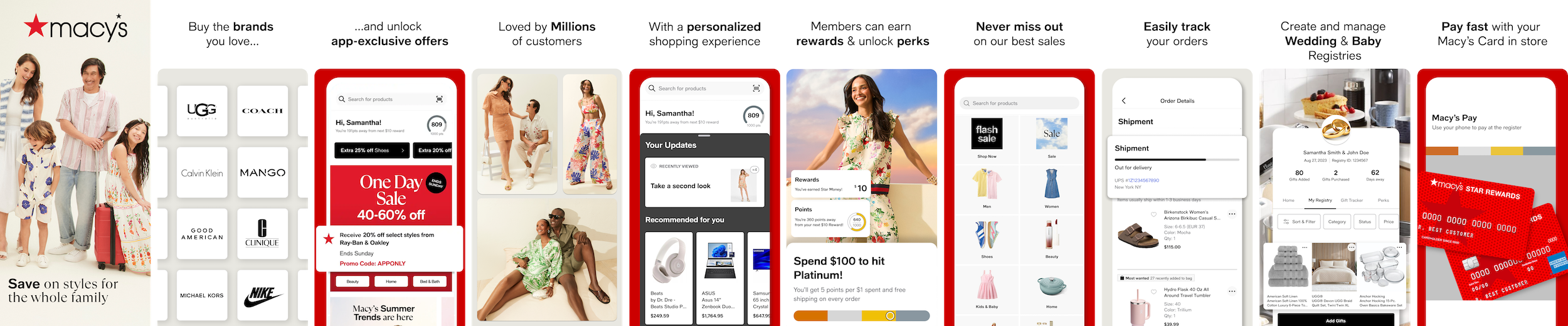
People weren’t interested in “Macy’s”…
…just what Macy’s provided.
That’s what made The Brands You Buy the lead horse.
We simply showed people they could get to the brands they wanted.
That second screen then became flexible. We could change the brands depending on what people were actually searching for. Ralph Lauren. Nike. Coach. Whatever the demand was pointing at.
Matching the storefront to the search. Not the other way round.
But as we pushed it further, something else started to show up.
The Macy’s shopper wasn’t one person. It was women, men, partners buying for each other, families. Customer insight backed it up.
Macy’s had traditionally led with women in their first screenshots.
So we tested it. Family-led imagery vs single audience.
Family won.
Every time.
The SOlution
Macy’s has history, scale, a rep most retail brands only dream of
But in the app world? Largely untrodden snow.
So, how could they embed themselves on the most valuable piece of advertising real estate in modern day—your home screen.
In a world of retail apps, why choose this one?
That was the job, in a nutshell.
There’d be Google campaigns. Meta. In-store pushes to app.
But every piece of traffic had to pass through one place:
The App Store (and Google Play) screenshots.
If those didn’t convert — everything bottlenecks.
And that little metric we all love starts creeping up:
CPI.
So, before scaling anything, this needed solving.
There are a couple of ways to approach it.
App Search Ads testing — useful, intent-driven, closer to the metal.
But for scale? You need something broader.
Apple and Google’s inbuilt testing.
Clean. Controlled. Generic traffic.
That’s where the real learning happens.
And where you open the floodgates to “download”.
Best practice?
Queue the A/B/C test.
Hypothesis 1: Reduce Risk
Social proof punches hard in app marketing.
“5 million happy shoppers.”
Shopper sees, shopper does. Old as time.
If enough people are already in, the decision feels safer.
So we led with scale.
User numbers. Social proof. First frame.
Hypothesis 2: Remove Friction
People weren’t searching for Macy’s.
They were searching for brands — already intending to buy.
Nike. Adidas. Zara. H&M.
The question wasn’t:
“Is this a good app?”
It was: “Can I get what I came for?”
So we made it obvious.
Brands front and centre.
Logos. Instantly recognisable.
Matching what people were already searching.
Hypothesis 3: Create Urgency
Summer outfits. Lower prices. Right moment, right context.
Search data showed clear spikes.
Intent wasn’t constant—it came in waves.
And when people feel like they’re getting a deal now—they move.
So we led with offers.
Seasonal moments.
Discounts upfront, not buried.
Enter Custom Product Pages
Not all traffic is created equal. Someone searching “shopping” is in a very different headspace to someone searching “Nike”.
Same app, completely different reason to install.
Apple and Google like to give marketers tool to allow for this fact, known as Custom Product Pages (Apple), or Custom Store Listings (Google).
So instead of forcing one story, we built variations around what people actually came for.
But to work out what was actually worth building, I used AI-led keyword analysis to see what was driving real volume into the app (activewear being one of them) — not what people could search, but what they were actually searching at scale.
For higher-intent traffic, that meant leaning into what they were actively looking for. Brands. Logos. Familiar signals. Less persuasion, more confirmation — a quick “yes, you’re in the right place.”
For broader traffic, it shifted. Here, the job wasn’t to match a product search, it was to create a reason to care at all. Social proof. Offers. Momentum.
However, it’s not always that clean — especially with competitor traffic.
If someone’s searching Nordstrom, there isn’t a clear intent to “match”. They’ve already chosen a direction.
So the approach shifts. Instead of matching, we needed to out-offer.
Macy’s had a strong clearance proposition (up to 70% off), so we built a CPP that leaned fully into that — and served it to competitor searches.
Less “we have Nike too.”
More “here’s a better reason to switch.”
That worked a treat.
THE RESULT
+18% uplift in App Store conversion rate across key trading periods
+12.6% YoY growth in organic installs
Once Macy’s stopped trying to explain itself and actually matched how people shop, things started working.
People landed and immediately saw what they came for. The brands they recognise. The moment they’re in. No filler, no figuring it out.
The traffic was already there. It just wasn’t converting properly.
That changed.
Better quality installs. Higher conversion. More first purchase revenue.
In short, the funnel stopped leaking.
And the storefront finally felt like somewhere worth buying from.