FAshion over features
app store revamp
for

•
Conversion Rate Optimisation
•
App Store Optimisation
•
content strategy
•
Testing strategy
•
creative direction
• Conversion Rate Optimisation • App Store Optimisation • content strategy • Testing strategy • creative direction
The challenge
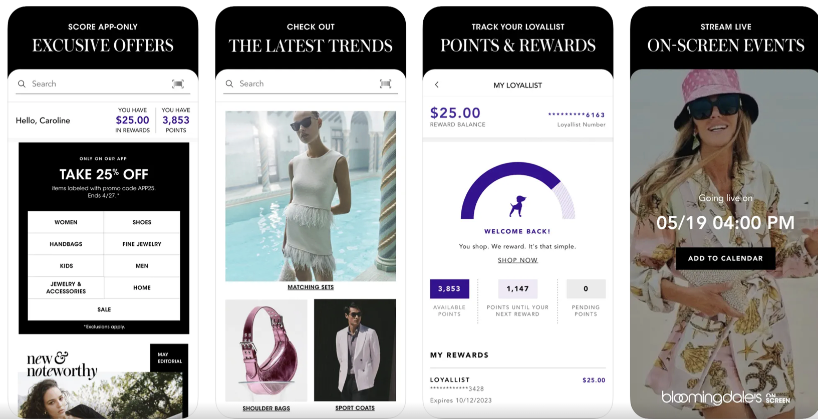
Bloomingdale’s App Store screenshots focused heavily on features like fast delivery, rewards and loyalty perks.
These were effective messages when retail brands were first shifting transactions to mobile. At that point, they acted as USPs - signals that shopping through an app was convenient and worthwhile.
But by 2024, these features were no longer differentiators. They had become expectations.
When every retail app offers fast delivery, loyalty programmes and personalised recommendations, those messages stop functioning as USPs and start functioning as expectations.
Yet Bloomingdale’s storefront was still dedicating its most valuable real estate to communicating them.
In effect, the screenshots were using prime App Store space to explain what shoppers already assumed.
The SOlution
So, functional features = dated. Where did that leave Bloomingdale’s?
A really exciting place. The opportunity to rediscover their voice and return to their brand roots, where the channel (the App Store storefront) wasn’t hijacking a premium fashion brand’s messaging with technical considerations.
That made the task simple.
Answer the question: Why do people shop fashion in the first place?
To feel sexy. Elegant. Hinge-ready.
That opened the door to using Apple’s Product Page Optimisation (PPO) testing framework to explore which imagery and copy would capture that feeling.
Two considerations shaped the work.
1. Design: What are people actually looking for?
Working with Bloomingdale’s Customer Insights team (and aligning with the App Store Optimisation team), we looked at year on year search volumes for specific clothing items.
Dresses. Suits. Sunglasses.
Categories that peak at certain points in the year.
If people are already searching for those moments, the design should lean into them.
2. Copy: App Store screenshots are ultimately a call to action.
The first screenshot is the most important (much like testing email subject lines). It carries the psychological hook that drives the download.
Through testing, one motivation proved strongest.
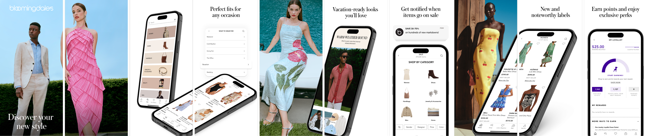
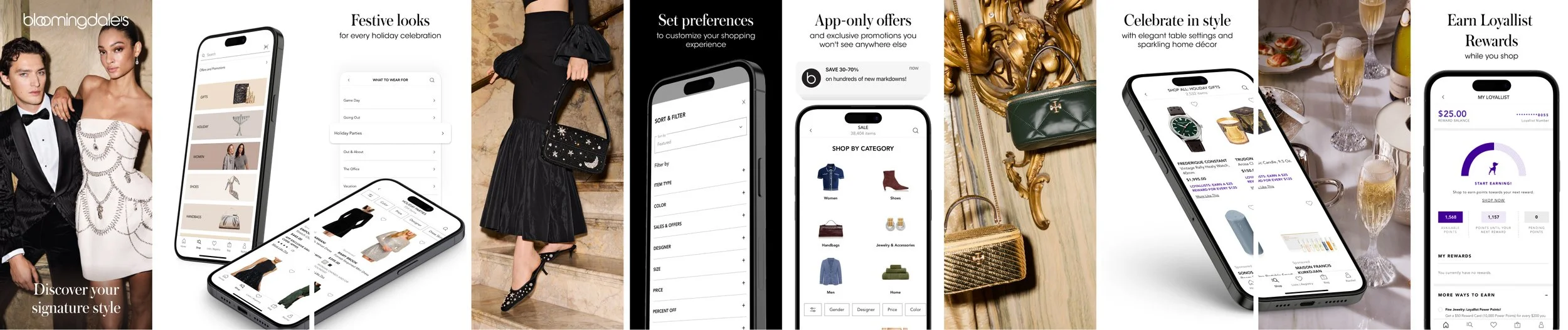
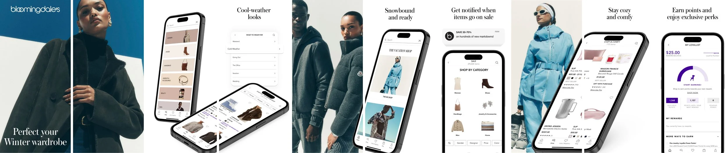
Discovering your new style.
Fashion is never over.
Retail seasons turn fast. A constant rhythm of launches, campaigns and micro-seasons. Which meant the App Store had to keep up.
Every season needed its own winning set.
Bloomingdale’s wider marketing machine - paid media, influencers, brand campaigns and outdoor - was constantly driving attention to specific seasonal moments. If the screenshots didn’t reflect those same moments, you’ve got a broken journey.
Imagine you’ve stopped your wee thumb scrolling on a Bloomingdale’s Meta reel.
A beautiful forest-green shearling coat. Just the thing for the Christmas party.
You click.
And land on the App Store to find…
…a pastel linen sundress, giant sunglasses and someone on the beach.
A question mark, exclamation mark combo appears over your head like a Sims character.
Confusion. Friction. Lost conversion.
The call to action was evergreen, but the creative evolved with the seasons.
Each cycle meant returning to the data. Watching shifts in search behaviour, aligning with campaigns, and making sure the creative matched what customers were actually looking for. And right quick. After all, running a sub-optimal App Store listing during the length of any given season?
Money on the table.
THE RESULT
+20% uplift in App Store conversion rate across the year
+8.57% YoY growth in organic installs
across the latest three month period
$43,430 in acquisition savings
based on Apple Search Ads CPI benchmarks
With similar performance sustained, that level of efficiency repeats each quarter.
By aligning Bloomingdale’s App Store presence with the rhythm of retail campaigns, the traffic the brand was already earning through search, paid media and brand activity began converting far more efficiently.
More of the right shoppers landing on the page. A storefront that matched the seasonal moment they arrived from.
Better traffic.
Higher conversion.
Greater first purchase revenue.
In short, a stronger funnel.
And a storefront that finally behaved like a modern fashion storefront should.